

What’s all this fuss about emotion?
We all know about emotions because we experience them every day. Emotions influence the way we make decisions, evaluate risks, solve problems and categorize information. In advertising and product design, emotions are a really well-known subject. In web design, emotional design has just recently made its way to usability. Design is still useful and usable but when we design for emotion we intentionally trigger emotional responses in our users, keeping them motivated and helping them perceive a personality.
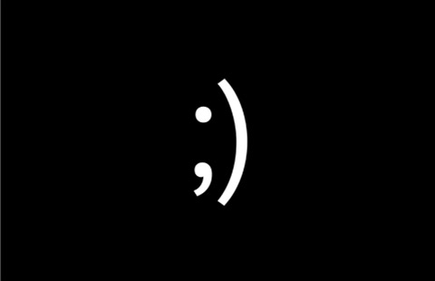
Emoticons: what kind of personality you can perceive from this emoticon?
In another words, when people are emotionally involved, they tend to create a relationship with your site and they will visit it again and again. But most of all, they will share the experience with other people.
3 Reasons to go for emotional design
Research has demonstrated that people without the capacity for emotional response are unable to make simple cognitive decisions, like what dress to wear today or what to eat for lunch. So emotions are important in everyday life, but why in design? Here are 3 reasons why we should go for emotional design:
Emotion dominates decision making
We experience emotion every day and through emotion we actually screen the world around us while making decisions.
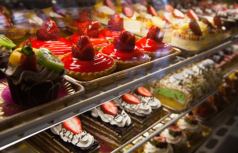
How do you decide which sweet to take?
Emotion increases motivation
Emotion, as we saw, commands attention and helps us to focus, it actually makes information memorable, resonant and eventually, actionable. If we trigger the right emotion, people are motivated and chances are high that they will perform the desired action or complete a task.

Does the sticker make you smile and the action is more fun to perform?
Emotion affects memories and creates personalities
We memorize things through association and emotion is the way we create negative/positive associations. Once we have defined the emotion, we give a personality to that product and we interact with it according to that personality.
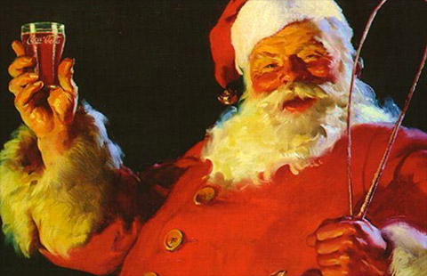
Is Christmas still brought to you by Coca Cola?
Typography fundamentals and reader mood
Two researchers from Microsoft, Kevin Larson and Rosalind Picard, conducted a study called the Aesthetics of Reading, to demonstrate the benefits of good typography. They found that good typography induces a good mood. In this study, participants were asked to read text with either good or poor typography. The participants who received the good typography performed better on relative subjective duration and on certain cognitive tasks. This should make us think that typography is a design element that needs our attention not only on the web, but in all design that employs the use of typefaces.
Before you start any project that includes the use of typography, there are some important typography fundamentals to take into consideration if you want to keep your reader motivated and browsing your site:
01. How typeface looks
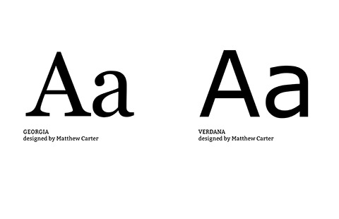
If you are not able to recognize the difference between serif and sans serif, well, this is the time to learn it. There are different font classifications. The most well-known is the one by Maxilliam Vox which you can read a bit about in my blog. What it is important to keep in mind is that typefaces look different and their "design" communicates a different personality and feeling (don’t forget to read my previous article, You only like me for my body).
02. Readability and legibility
Although, the two terms seem to define the same thing, in typography the difference in quite distinct.
Legibility is good when we are able to distinguish one character from the other. Readability is more about a block of text and how we can easily go through it. To improve legibility, you have to focus on kerning. Kerning is the space between two specific words.
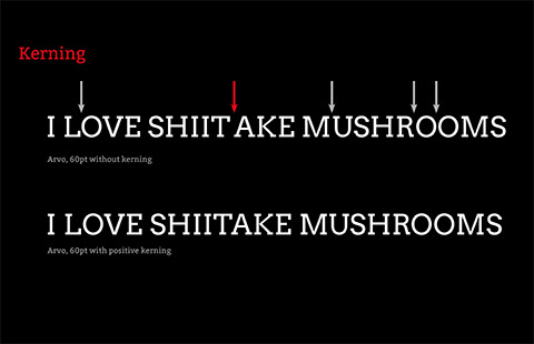
As you see in this example there is a critical kerning that must be adjusted between the A and the T to avoid misunderstanding.
Today CSS has a property called Optimize Legibility, but I think that Kern.js gives a better result. I suggest that you focus on kerning when you write big headlines.
You can improve readability using tracking.Tracking is the uniform space between letters. In CSS there is the property letter-spacing that does exactly this, spacing letters uniformly, but the plug-in, Lettering.js, also does this.
![]()
In the second sentence I gave positive tracking to improve the space between letters, especially between the L and the A.
On the web be sure to use both kerning and tracking for big text and headings, and in all the texts that drive user’s attention.
03. High Contrast
Jakob Nielsen, one of the most authoritative voices in user interface, said that generally low contrast text causes eye strain and discomfort to readers. Gray text is sleek and elegant, but this is good on paper, where the result is almost certain not to hurt your eyes. On the screen, things are different because we rely on the brightness of the screen which is not the same for everybody!
Try to avoid making your user struggle to read
04. Scalability
Each time a discussion pops up about responsive design, the common terminology and concepts that get the maximum amount of attention include grids and images, and obviously the settings like "fluid" or "flexible". In 2006, Oliver Reichenstein, founder of Information Architects, wrote an article titled Website is 95% typography, where he pointed out something really important: treat typeface like interface. So always check the size, type and the line length and how these two elements look on different devices.
For example, a good size for screen body text is about 14 and 16px and a line length between 50/75 characters. You can divide text into columns to avoid long lines or give a maximum width based on percentage or ems. It takes a small amount of effort when you code, and gives great results.
05. Hierarchy
A clear understanding of hierarchy results in more beautiful, meaningful, and communicative designs that better serve yFfeour audience. Furthermore, as Steve Krog in his book, Don’t Make Me Think, says, "people don’t read, but they scan pages".
Can you see any hierarchy here?
But here you can see the different levels of interaction and information is easier to manage
To create hierarchy, you should organize all the headings on our website really well and separate information into manageable chunks, properly using white space so that a reader’s eyes can easily identify elements on our page.
06. Tone of voice
When you write for the web, tone of voice is an important tool that helps users understand and define the personality of your site.This is why tone of voice should be consistent and depend on the context and the way typeface looks (see point 01.Look).
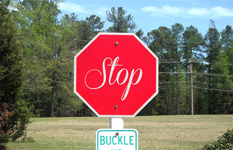
Are you going to stop?
A few tips to evoke emotion through typography
There are different and creative ways to use typography on websites to engage your audience. In the following examples, you will learn how typeface can be a powerful tool to express personality, grab attention and create memories.
Draw attention
When you use typography to draw attention, you really have to:
- Reduce distractions, organizing all the information really well (hierarchy),
- Check that size and amount of white space are consistent on all devices.
Because people scan pages, you have to organize information for their memory in such a way that there is a sense of control and the task can be completed. Usually the emotions we want to evoke are confidence, trust, consistency and the typefaces used are simple, clear and classical typefaces like: serif, sans serif and also, slab serif.
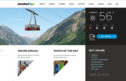
Snowbird is a site that promotes a resort where the main attraction is the snow and the opportunity to ski and snowboard. Of course, if you are planning a weekend to go snowboarding, you want to be sure that there is snow. In fact, as soon as you load the page, one of the most prominent pieces of information is the weather forecast. A big bold sans serif font is used to indicate the temperature and on the lower part of the site you can see three other different blocks of information, highlight by bold and capital sans serif titles. Font consistency is also on the inside pages where a clear hierarchy helps the reader to easily spot different elements of the site (ie- news, holiday packages...).
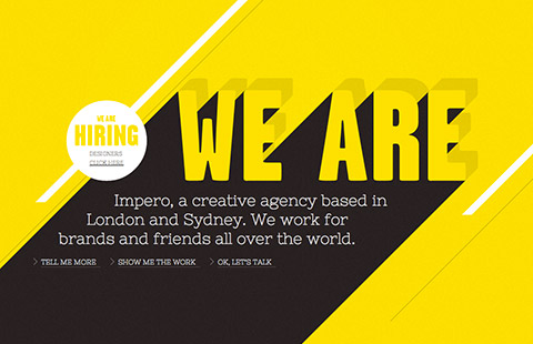
Another element you can add to typography to draw attention is of course color. This is Impero, a British creative agency based in London and Sydney. On their website, there is the use of big contrast in colors, yellow and black. Contrast (intended here as different font families and sizes) is also created by the use of three different typefaces: a big, bold and capital sans serif font to indicate where the user is, a second level web font, in slab serif, that describes the page, and finally a simple and plain sans serif font, used for a more descriptive part (like the work descriptions). Typography, along with color, is the only design element used in the whole site, of course transitions between pages also create a dynamic and engaging user experience. The general result is a really straightforward and clear website.
Add character and personality
As human beings, we are able to perceive personality in things and to form relationships based on that personality. You can use typography to communicate personality but when you do so, you should pay attention to:
- How the font looks, choosing the main typeface carefully, so it will give personality to your website.
- Giving just one personality and defining the tone of voice.
- Fitting in with the context.
Only in this way can you easily interact consistently with your audience and forge a strong relationship.
Personality #1: Personal and human
In this case, the feelings you want to evoke are spontaneity, friendliness and authenticity. Fonts used for this purpose are script or handwritten typefaces.
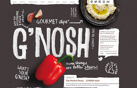
G'NOSH is a British company and on their site, they advertise their healthy food and fresh products. They care about the quality and tradition. The feeling you get when looking at their site is not so different from that which you get when looking at blackboard in a bar. The feeling you get is comfort from knowing that experts’ hands have put together a fresh and authentic variety of products for you. Big handwritten headings decorate this site, giving information about the brand. Some of them are also links. The main body text is written in a clear slab serif font.
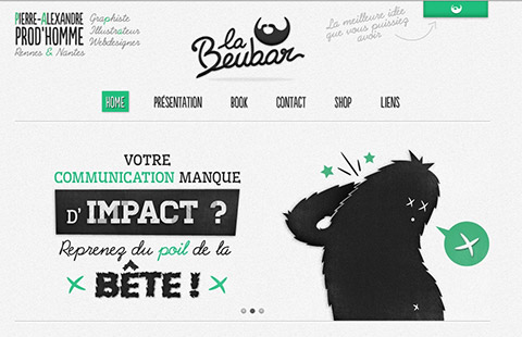
The site of this French designer and illustrator is really characteristic and creative in the use of different handwriting and script typefaces. He uses a really personal and consistent style throughout the site.The font is creative and unique, as is the way he presents himself and his skills.
When you use script typefaces it is also important not to exaggerate. In this site, the Fountain of Youth, this script is use all over the site. Instead of giving consistency, it just compromises the legibility and the readability of the text. Remember that script fonts are nice if you use them in the right size and context.
Personality #2: Fun and informal
When we go for this approach, the range of typefaces can be really wide. But again, they should fit the context. The feelings we want to evoke are usually happiness, humor, joy and exuberance.
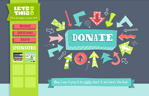
This website is gathering money for cancer research, but their tone of voice is fun and humorous. In fact, they are aware that people in a positive mood are able to perform the desired task, in this case, making a donation, better and more easily. So fonts here are all different and this gives movement and color to the page, empowering the sense of humor. Every element in the design is unique and contributes to creating a homogenous look and feel.
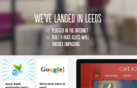
Engage is a creative agency in Leeds, UK. The general feeling of this site is humorous. The funny side of this site is the use of an irregular sans serif font that highlights specific sections of the site, like the slideshow or the testimonials. On most parts of the site, like news and work, the font they choose is a slanted, smooth sans serif font, still friendly but able to maximize legibility and create a sense of consistency.
Personality #3: Fun and informal
When the feelings you want to evoke are seriousness, professionalism and credibility, you are not going to use more than two typefaces on your page, and usually these are the classic ones, like serif and sans serif. Also use of color is reduced to the minimum and is used mostly to highlight specific aspects of the website.
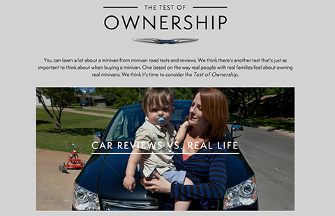
Chrysler’s website talks about users and the experience with their cars. The site is really clear. Hierarchy is sturdy and bold. Throughout the site, the font used is a sans serif. Headings are capitalized to command attention and authority (lettering is also applied to improve readability). The experience of driving Chrysler’s cars is extended to the way you navigate the website: you perceive a sense of control and precision in the movement. Colors are really limited and images are predominant to enhance user experience.
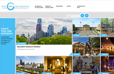
On the site, With Art Philadelphia, the feelings they want to instill are trust and reliability. The audience of this website can be different in age and interests, so they "play it safe", using a plain, young sans serif font for headings and call to action buttons, and a more traditional serif for body text, breadcrumbs and small links. The use of color is really limited to cyan, white and dark gray, while text and images follow a rigid and clear hierarchy.
Create memories
Typography can tell a story. Aristotle, the Greek philosopher, said that people can easily memorize stories if they recognize a start, a main plot and a conclusion. So, if you want to enhance memories and create a unique experience, you need a sophisticated font that reminds the reader of something else through association. The feelings you want to evoke are engagement, desirability and interaction. The fonts used can range from scripts to a simple sans serif.
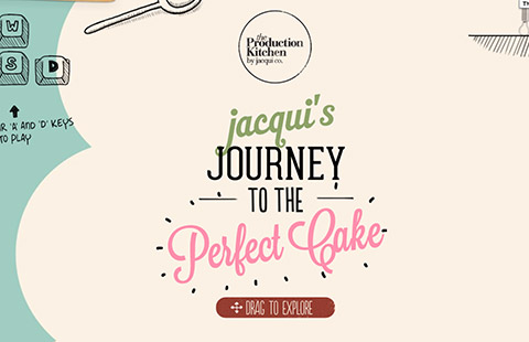
The Production Kitchen is a great website to explore. The color palette is based on pastel colors. The fonts used are different kinds of handwriting, hand-designed sans serif and serif fonts and design elements, along with pictures. The large choice of different typefaces gives the site a unique feeling which perfectly fits the purpose of this company, which produces handmade cupcakes to order. The overall look is cute, but also catchy and exciting.
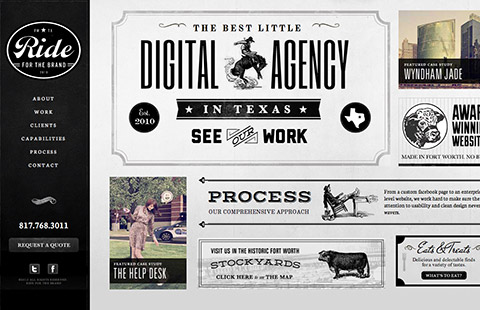
The Ride creative agency is instead telling you a completely different story. Black and white flourishes, ink drawings and old style pictures decorate the entire website. But what really brings you back to the Old West is the use of different chiseled and hand tooled typefaces. If you haven’t realized it, The Ride is an agency from Texas. I think the association is clear throughout the website. The design is decorative, but also extremely fun and inviting.
Conclusions
Typography is the real, almost invisible protagonist of any website. When we work with typography, we inevitably have to consider different fundamental aspects that can influence a reader’s mood. In the end, if we want our users’ experience to be engaging and exciting, we should definitely consider adding emotion to our website. When we do so, we have to keep in mind that emotion, personality and tone of voice are consistent throughout the site and communicate the brand’s values in a correct way. Only if we have given emotion and typography the right consideration, will we be able to communicate in a way that appeals to and amuses our audience.
Note: This article is created based on the talk I gave at the Joomla Day Netherlands conference, that took place in Zeist on 19- 21 April 2013. The slides of the presentation are available on Slideshare. Comments, corrections and improvements are always appreciated.
