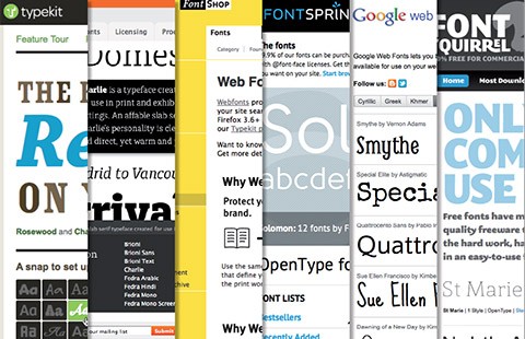
Suddenly web designers had access to typeface as never before. There are many websites now that sell or distribute free fonts available for the web. But choosing a typeface is not easy or obvious. Not even for the most experienced web and graphic designers. It’s like going on vacation and deciding what it is best to take with us. So before we pack our “font suitcase” it is good to really know what our task is and what kind of message we want to communicate.
If you have never thought about it, you should consider reading this article carefully!
Looking at Typeface
You can understand a person by the way he/she moves, talks or dresses. Appearance is something really important that helps us relate to other people. If you see a man in his perfect grey suit behind the desk at your insurance company, you feel you can trust him because he looks serious and reliable. The same man with a Rastafarian hairstyle and a psychedelic shirt wouldn’t give you the same feeling, right? You would think you were at the wrong place...or even more likely, he is in the wrong office!
Well, I don’t want to give the impression of being a superficial person, but let’s face the truth: appearance plays a big role in our daily lives! And this can happen also with typeface!
Each typeface has its own personality and this is something you can understand from the way it looks.
So before we start talking about the “character” of a typeface, let’s first identify some “physical” elements that determine the specific typeface’s appearance:
- Typeface Anatomy
- Typeface Classification
- Kerning and Tracking
- X-Height
- Language
a) Typeface Anatomy
Knowing the anatomy of typeface is really important to identifying it.
Some of them have the suggestive names of real parts of the human body!
It can sound a bit poetic, but typeface designers look at fonts as “small creatures” with specific “eyes”, “shoulders”, “necks”, and “ears”, just to mention some terms. We will consider just a few elements because this is not the main subject of this article. I have provided you with different links for further reading at the end of the page, under Resources.
Let’s start with the external parts, as I call them, the Skin and Body.
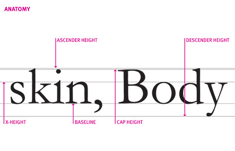
X-HEIGHT: the height of the lowercase letters, typically represented by the letter x; a typeface with a big x-height looks bigger than a typeface with a small x-height, but both are the same size.
ASCENDER HEIGHT: the top line that the tallest letters, like "k" of the word "skin" and the "d" of the word "body", touch; usually it slightly extends over the cap height.
DESCENDER HEIGHT: the bottom line that the lowest part of lowercase letters touch, below the baseline, as can be seen with the letter "y" of the word "body".
BASELINE: the line where all the letters sit; this is a crucial element in order to align text with images and other content.
CAP HEIGHT: the distance from the baseline to the top of the capital letter; it determines the letter's point size.
Moving deeper, we can analyse what I call the Bones of a typeface.
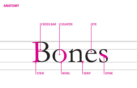
STEM: the main vertical stroke of a letterform.
CROSS BAR: the horizontal stroke across the middle of uppercase "A, B, H".
COUNTER AND EYE: the enclosed or partially enclosed circular or curved negative space (white space) of some letters such as "d, o"; the eye refers specifically to the enclosed space in a lowercase "e".
BOWL: the curved part of the character that encloses the circular or curved parts of letters like "d, b" or the capital "B" you see in the word "Bones".
SPINE: the main left to right curving stroke in "s".
SERIF: a little extra stroke, useful to differentiate a Serif font from a Sans Serif.
b) Typeface Classification
When you get to know somebody, after looking at him/her and asking a few general questions about work and life, you will probably ask where he/she comes from, trying to identify his/her nationality.
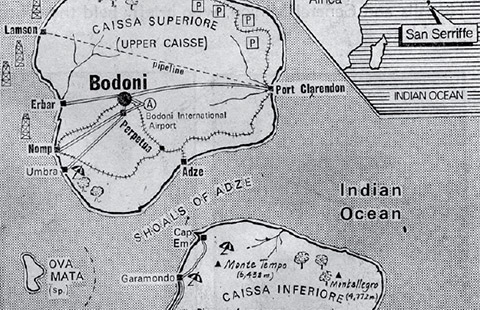
What you see here is geographical map that the newspaper, The Guardian, published in 1977 as a special report of the Islands SAN SERIFFE. This was a quite eccentric way to introduce fonts and typeface classification!
However, many people and companies have tried hard to describe and classify typefaces.
The most common method is the one introduced by Adobe which you can see in the picture below. Many font styles are missing from the key system of typeface classification called VOX, named after the Frenchman, Maximilien Vox.
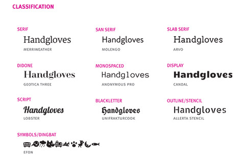
SERIF: typefaces with semi-structural details (serif) on the ends of some of the strokes that make up letters and symbols; widely used in traditional printed material such as books and newspapers.
SANS SERIF: typefaces "without serifs"; highly legible for both display and text use.
SLAB SERIF: born out of the Industrial Revolution, these typefaces have little, if any, contrast between thick and thin lines; serifs have no brackets; extremely effective for commanding readers' attention.
DIDONE: Serif typefaces characterised by extreme contrast between thick and thin lines
MONOSPACED: Sans Serif typefaces with fixed widths (all characters occupy the same amount of horizontal space, as with a typewriter).
DISPLAY: typefaces that are most effective when used at large size for display purposes, such as headlines and titles, posters and billboards.
SCRIPT: typefaces that mimic handwriting techniques by joining letters with connecting lines.
BLACK LETTERS: referred to as Old English or Gothic, they were used for text in Germany until World War II (font FRAKTUR); today they are primarily used as display typeface.
OUTLINE/INLINE/STENCIL: these display typefaces have a special design appearance on the face of the letters, as if highlighted, engraved or “tooled” on the left side of the character strokes.
SYMBOLS: typeface that can add a finishing touch to a project or help with specialised tasks; the most famous is ZAF DINGBAT of Hermann Zapf.
c) Kerning and tracking
Suzanna Licko, co-founder and typeface designer at Emigre Foundry, used to say: “You read best what you read most”. Saying that, she was pointing out that people read better what they are most used to seeing and recognising.
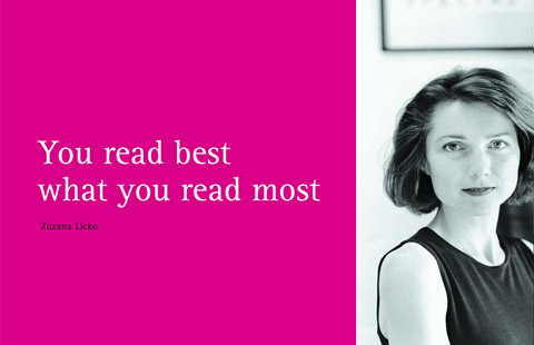
To make this “spell” happen, we should consider two important aspects in choosing a font, its readability and its legibility.
Readability is how easy it is to read words, phrases, blocks of copy such as a book, a web page or an article.
Legibility is a measure of how easy it is to distinguish one letter from another in a particular typeface.
There are different factors that can determine if text is readable and letters are legible, two of the most important are kerning and tracking.
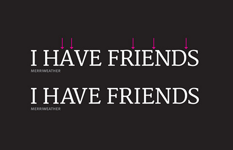
Kerning is the adjustment of space between 2 letters. And the general rule among designers is that a good font needs a small adjustment, or none at all.
![]()
Tracking is the adjustment of the overall space between groups of letters (ie- between words).
And again, a good font needs only a small adjustment. It is a TYPE CRIME to letterspace lowercase (that is, to put extra space between lowercase words)!
“A man who would letterspace lower case would steal sheep”, Frederic Goudy liked to say. And he was right!
The reason for not letter-spacing lower case is that it hampers legibility because these characters are designed to sit closely together in a line.
d) X-height
We should really consider the X-height of typeface which affects its apparent size (a font with a big x-height seems to be bigger than another font set at the same point size), its space efficiency and the overall impact.
X-height is an important aspect in typography because, in the recognition process, the upper portion of letters may contain more “visual information” than the lower part.
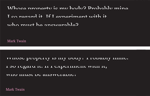
In fact, looking at the image above, if we cover the lower part, it is easy to recognise which letters compose the sentence, but we can hardly say the same if we cover the upper part.
e) Language
Before you start using a font (especially a free font!), be sure that your typeface choice has all the necessary letters and glyphs in the language and topic you are going to work with! Some fonts available on the internet lack letters with accents, ligature, fractions, ordinal numbers, punctuation marks, mathematic symbols and currency.
Are you sure I’m your type?
There is no such a thing as a neutral typeface.
Typefaces always transmit something, many times in several directions.
That’s why it is a difficult task to choose one!

In 2001, the printer manufacturer, Lexmark, started a kind of research in collaboration with Aric Sigman (a psychologist who knew almost nothing about typography), called “The Psychology of Fonts”.
It was a kind of social coding: trying to understand what kind of person was behind the typeface that he/she was writing with. More or less, it’s the same kind of thing we usually do when we describe the temperament of a person, basing our conclusion on the way they look or the music they listen to or the food they eat.
From this research, came the conclusion that Courier is for nerds and it is the favourite font of librarians and data entry companies, while people using curvy, smooth fonts, like Shelley, tend to be more appealing and elegant. Univers is for safety and anonymity while Comic Sans allows for more expression of character.
This was a funny piece of research that demonstrated that even if it is not what you want, typefaces will always communicate something more than the text contains!
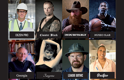
In the picture above, I have done my own “typographic research”: I have tried to match these portraits of people, with a font that could possibly represent their personalities.
You would probably choose a different type for some of them...
I admit that sometimes choosing a typeface is so subjective that the task itself becomes quite daunting. This is why I have provided my choice with an explanation.
DEZEN PRO: This is a quite modern and clean font; class Sans Serif. It is probably an alternative font that would fit well with an engineer and could be MONOSPACED, with fixed widths.
CLOISTER BLACK: This is a black letter font, really popular in heavy metal music and beer labels.
INDUBITABLY: This is a chisel font with a straight serif. If we think about old Westerns and cowboys, for sure what comes to mind are all the signs carved in wood.
MUSEO SLAB: This is a Slab Serif font, which is considered a Modern Style of Serif. It is really common in sports. The first examples that come to my mind are CONVERSE SHOES and the names written on the back of players’ jerseys in basket or soccer (usually this choice is dictated by the high legibility of the letters of this type of font, even from far away and when players are moving!).
GEORGIA: This is a Serif font. Designed by David Carter and commissioned by Microsoft (like Verdana), I think this is one of the clearest and most legible fonts on the web and it fits well with poets and writers.
TANGERINE: This is a calligraphic font with light strokes, flounce and ornate capital letters which really recall something elegant and sinuous, like the body of a dancer. It is not to be confused with the following typeface I have used for our fast food waitress.
PACIFICO: This font resembles human script and has a sense of movement that expresses something friendly, optimistic and spontaneous.
LEAGUE GOTHIC: This is a display font with strong and confident strokes. It is also a little bit narrow, so that it looks serious and gloomy.
Just my type!
Now, we have selected our typeface, put it in our suitcase and we are ready for our destination: the web page. But once we put it on a page, surrounded by other elements, images and colors, and we have created our layout, it takes on a different look and we are probably not so sure if we really like it anymore. But most of all, we are not sure if the message we are delivering is still the one we intended!
Below, I have collected some examples to illustrate how you can produce a certain message or feeling. Don’t take them as you would some perfect recipe for your birthday cake, but instead take them more like general guidelines. Don’t worry; everything will get easier with experience. And when we are not sure, the best thing we can do is some research in other fields, not just in web design, to see how others have faced the same issues and what font they have used!
Movement & Action
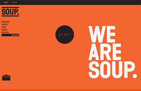
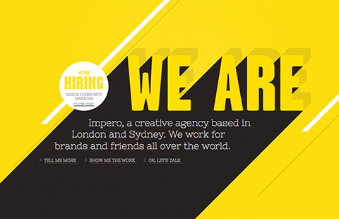
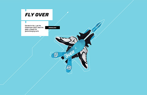
When we think about movement and action, we want something fast, something catchy and easy to read. Generally, we will delineate the following elements:
- Font: sturdy, heavy Sans Serif font or Slab Serif font.
- Layout: simple, clean or sometimes unconventional layout and non-linear navigation; creative use of parallax effect.
- Color: strong color contrast.
Here some good examples:
Soup Agency
We are Impero
Air Jordan 2012
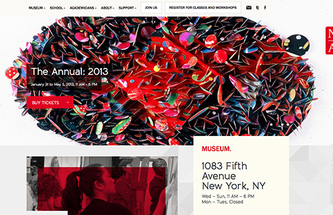
National Accademy
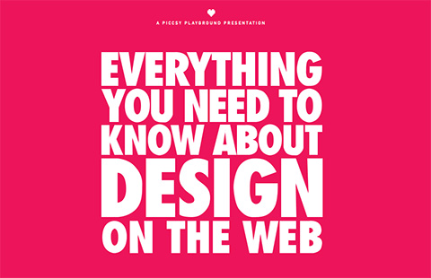
Everything you need to know about design on the web
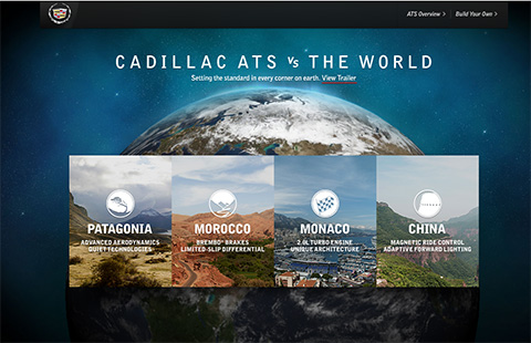
Cadillac ATS
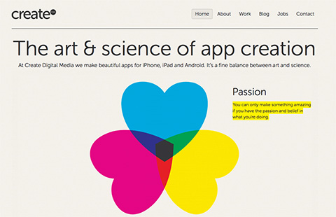
Reliable & Modern
To achieve this style, we have to look for a workhorse typeface. When I say workhorse, I don’t mean necessarily Helvetica. I mean a font with a good family construction (it has different styles, as bold, normal, italic, light...), a really good, accurate design and versatility.
- Font: solid modern or classic typeface used in different families (italic, bold, regular, slanted).
- Layout: clean hierarchy of information; use of attention-grabbing images.
- Colors: colors are not always strong; preferences for hues of colors that fit with one strong color (usually a color that distinguishes the brand).
Here some good examples:
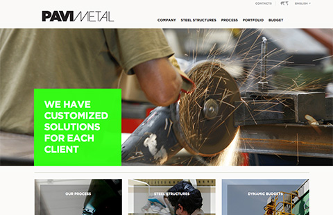
Pavimental
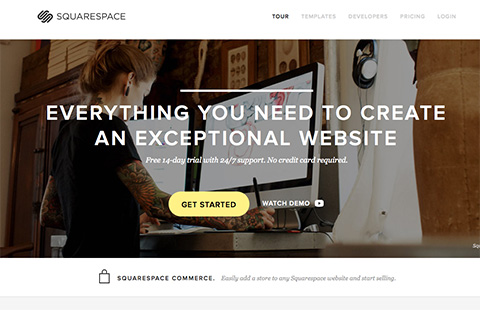
Squarespace
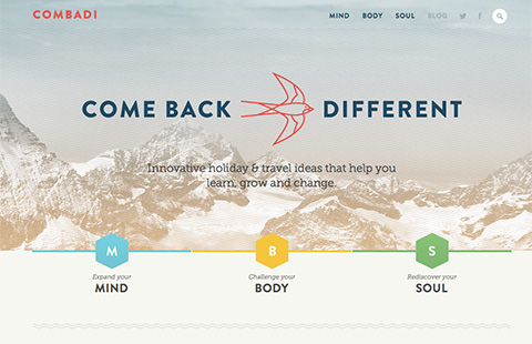
Combadi
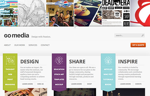
Go Media
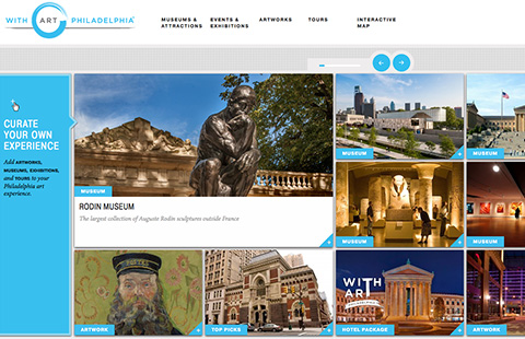
With Art Philadelphia
Create DM
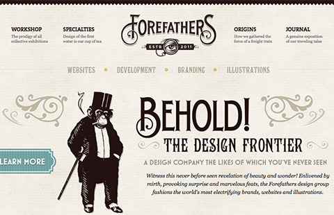
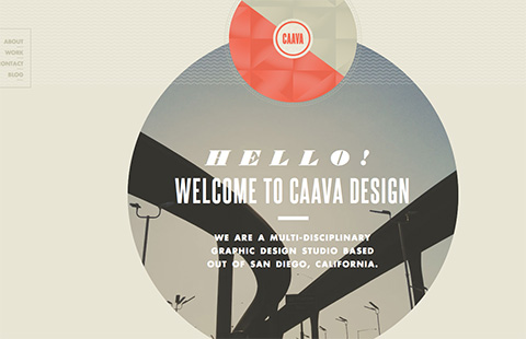
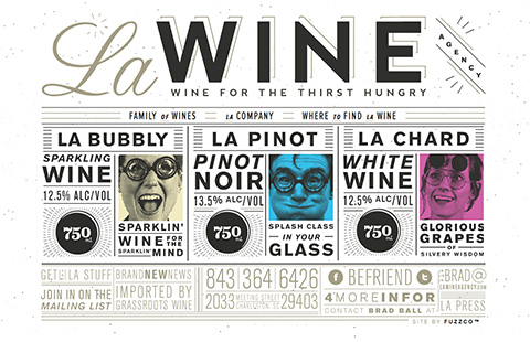
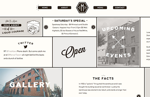
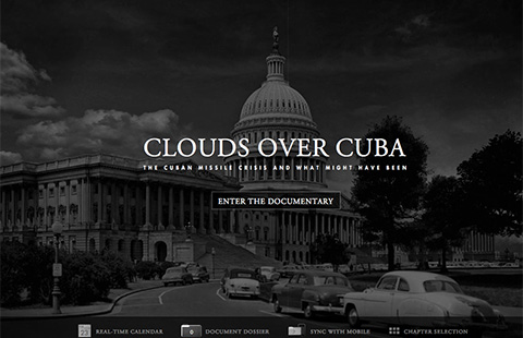
Vintage & Retro
Lately, the internet has become like the set of Pleasantville, a movie from 1998 set in the 60‘s. When we talk about vintage, we usually consider the following elements:
- Font: calligraphic font or different old-fashioned typefaces (Slab Serif, engraved, hand-tooled) on the same page.
- Layout: large use of attention-grabbing illustrations, halftone, washed-out, black and white pictures.
- Colors: vibrant or pastel colors, washed-out colors.
Here some good examples:
Forefathers Group
Caava Design
La Wine Agency
Mercer Tavern
Clouds over Cuba
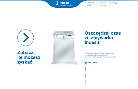
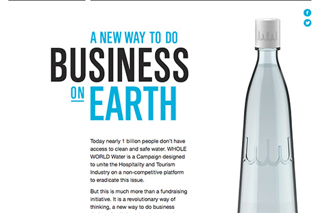
Elegant & Formal
If we desire to produce a clean and elegant design, our attention must go to the typography details and to balancing the content with images. The use of color is really limited.
- Font: attention to typographic details; limited use of typefaces.
- Colors: limited use of colors (1 key color + white/gray)
- Layout: content first; balance between images and text.
Here some good examples:
Zyskajczas
Whole World Water
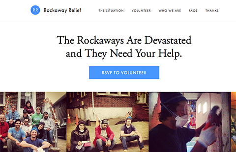
Rockaway Relief
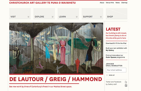
Christchurch Art Gallery
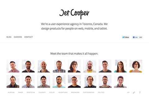
Jet Cooper
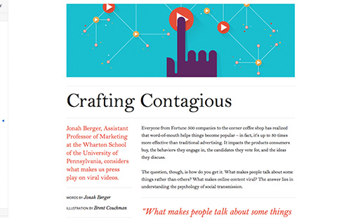
Think with Google
Conclusion
Now you are probably asking yourself, “Why bother with all these typefaces and their personalities when designing websites is already a difficult task?!” I suggest you take everything as a positive challenge. Every day new fonts are released, giving us the possibility of keeping things interesting and expressing ourselves in a creative, inventive way!
I am sure that from now on you will look at type with different eyes!
Resources
About typography
Books
- Just my type
Simon Garfield 2010, Profile Books, London - Thinking with type
Ellen Lupton 2010, Princeton Architectural Press, NY - Stop stealing sheep
and find out how type works
Erik Spiekermann, E.M. Ginger 1993, Adobe Press, NY - 22 tips on typography
(that some designers will never reveal) and 22 things that you should never do with typefaces (that some typographers will never tell you)
Enric Jardί 2007, Actar, Barcelona


